Blank
A Vercel-like developer portfolio website template made with Typescript and SvelteKit.
Mycoolchart Chart
My Interactive Chart Test
This is a standard paragraph written in plain markdown. It will get the default typography styling from your .prose class. The components below allow us to break out of that default style for more visual impact.
Summary of Key Findings
Executive Summary
Key Metrics
need to change something here.
Here are some important statistics related to this project, displayed using the StatCard component.
Methods: The Alternating Layout Pattern
Here we demonstrate the alternating image and text layout. It’s not a component, but a pattern you can copy and paste.

Step 1: Data Acquisition
This section contains the description for the first step, placed to the right of the image. You can include paragraphs, lists, and other standard markdown elements here by wrapping them in the appropriate tags.
Step 2: Preprocessing
For the second step, the image is on the right and the text is on the left. The `md:order-last` class on the image's container `div` is what flips the visual order on larger screens.
Results & Code
The results are processed using the following Python script. The CodeBlock component provides a title and a copy button.
title: "Component Tests" description: "A test page for the Accordion and CalloutVar components."
Accordion Test
This component is useful for hiding supplementary information that the user can choose to expand.
CalloutVar Component Showcase
Here are all the available style variations for the new CalloutVar component.
Summary
Methods
Results
Conclusion
General Information
Idea or Hypothesis
Quote
Warning
Dataset
Documentation
Code Note
Audio Clip
title: "InfoCard Component Test" description: "A test page for the new InfoCard component and its grid layout."
Three-Column Layout
To create a grid, wrap your InfoCard components in a div and use Tailwind’s grid classes. Here, md:grid-cols-3 creates three columns on medium screens and up.
Objective
Hypothesis
Scope
Six-Card Layout (3 Columns, 2 Rows)
The grid automatically wraps when you add more cards than the number of columns. Adding six cards to a grid-cols-3 container naturally creates two rows.
Variable A
Variable B
Variable C
Control Group
Assumptions
Limitations
This is my testing ground for web design. Please ignore.
MyCoolChart />
z ---------------------Chart.js Chart
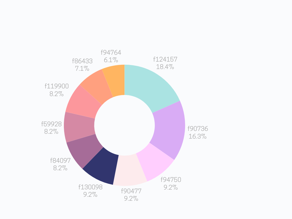
Donut Chart
Layout Component Examples
Example 1: Large Box on Left
Project Overview
This is the main content area. You can place any text, images, or other components here. The background color of this box is configurable.
Details
Key Features
- Configurable colors
- Flexible content
- Responsive layout
Example 2: Large Box on Right (No Background)
Details
Status
Version: 1.0
Last Update: 2025-10-01
Technical Details
This large box has its background color set to 'none', making it transparent. The layout is reversed, with the small callout appearing on the left.
Heading 3
Heading 4
Health Data Analysis
This page visualizes key health indicators across Canada. Use the dropdown to explore different metrics.
This concludes the analysis of provincial health data.
Heading 5
title: Market Analysis
Comprehensive Market Player Analysis
Here is the interactive mind map outlining the key players in the animal sensor market. You can pan, zoom, and interact with the diagram directly.
The analysis is divided into three main categories: Wearable Sensors, Imaging Technology, and Environmental Monitoring.
Heading 6
Chronic Disease Rate Explorer (Age 65+)
Use the checkboxes to compare chronic disease rates over time for different provinces.
Loading chart...
title: My Health Map Page
Provincial Health Snapshot 🗺️
Here is an interactive map of health data across Canada.
Map here
Analysis of High Blood Pressure vs. Senior Chronic Disease Rates for 2019.
Loading chart...
Your paragraph text will start here and flow around the right side of the image. Continue writing as much as you need, and the text will wrap naturally. Once the paragraph is taller than the image, the text will go back to filling the full width of the container. It’s a clean and effective way to integrate visuals.
Svelte is a free and open-source front end component framework or language created by Rich Harris and maintained by the Svelte core team members.
Fracture Localization in Radiographs using Transfer Learning with TensorFlow
Hypothesis
A convolutional neural network, fine-tuned on labeled radiographs, can localize