Health Nexus in aging population.
The Health Nexus: Aging, Chronic Disease, and Mental Health in Canada.
The Health Nexus: Aging, Chronic Disease, and Mental Health in Canada
Project Goal
To create a Power BI dashboard that helps healthcare administrators and researchers monitor the efficiency of clinical trials, from patient recruitment to trial completion. This project complements population health research by focusing on operational efficiency, showcasing ETL (Extract, Transform, Load) skills.
Skills Utilized
- Data Modeling: Integrated data from multiple sources (CCDSS and Statistics Canada) to build a robust data model in Power BI.
- DAX (Data Analysis Expressions): Created complex calculated columns and measures, e.g., to calculate co-occurrence of chronic diseases with mental health conditions across age groups.
- Data Visualization and Storytelling: Developed a compelling narrative through a dashboard allowing exploration by region, age group, and chronic conditions.
- Regulatory and Policy Awareness: Used publicly available, anonymized data to adhere to privacy and regulatory standards, critical for health research.
Dataset
- Canadian Chronic Disease Surveillance System (CCDSS): Data on dementia (including Alzheimer’s disease) from 2002–2024. Source for dataset: CCHS
- Canadian Community Health Survey (CCHS): Public Use Microdata File (PUMF) 2019–2020, with relevant data selected using the provided dictionary. Source for dataset: CCHS
Methods
Phase 0: Setup and Installation
This phase involved installing Power BI Desktop to set up the necessary tools for the project.
Phase 1: Data Acquisition
- Chronic Disease Data: Downloaded data tables from the Public Health Agency of Canada’s CCDSS, selecting national-level data on dementia, mood/anxiety disorders, and diabetes.
- Demographics/Health Survey Data: Acquired public use microdata files (PUMFs) from the CCHS via Statistics Canada, providing data on age, location, and self-reported mental health.
- File Organization: Saved all .csv and .xlsx files into a dedicated project folder for easy access.
Phase 2: Data Cleaning and Modeling
- Data Import: Imported CCDSS and CCHS .csv files into Power BI.
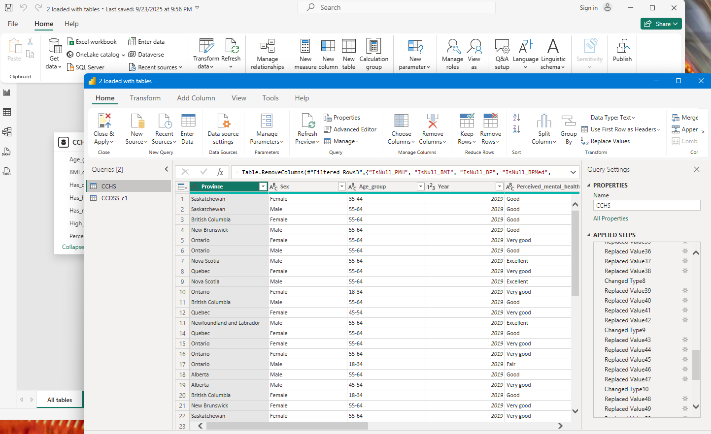
- Data Transformation: Used Power Query Editor to remove unnecessary columns, handle missing values, correct data types, and filter for required information.
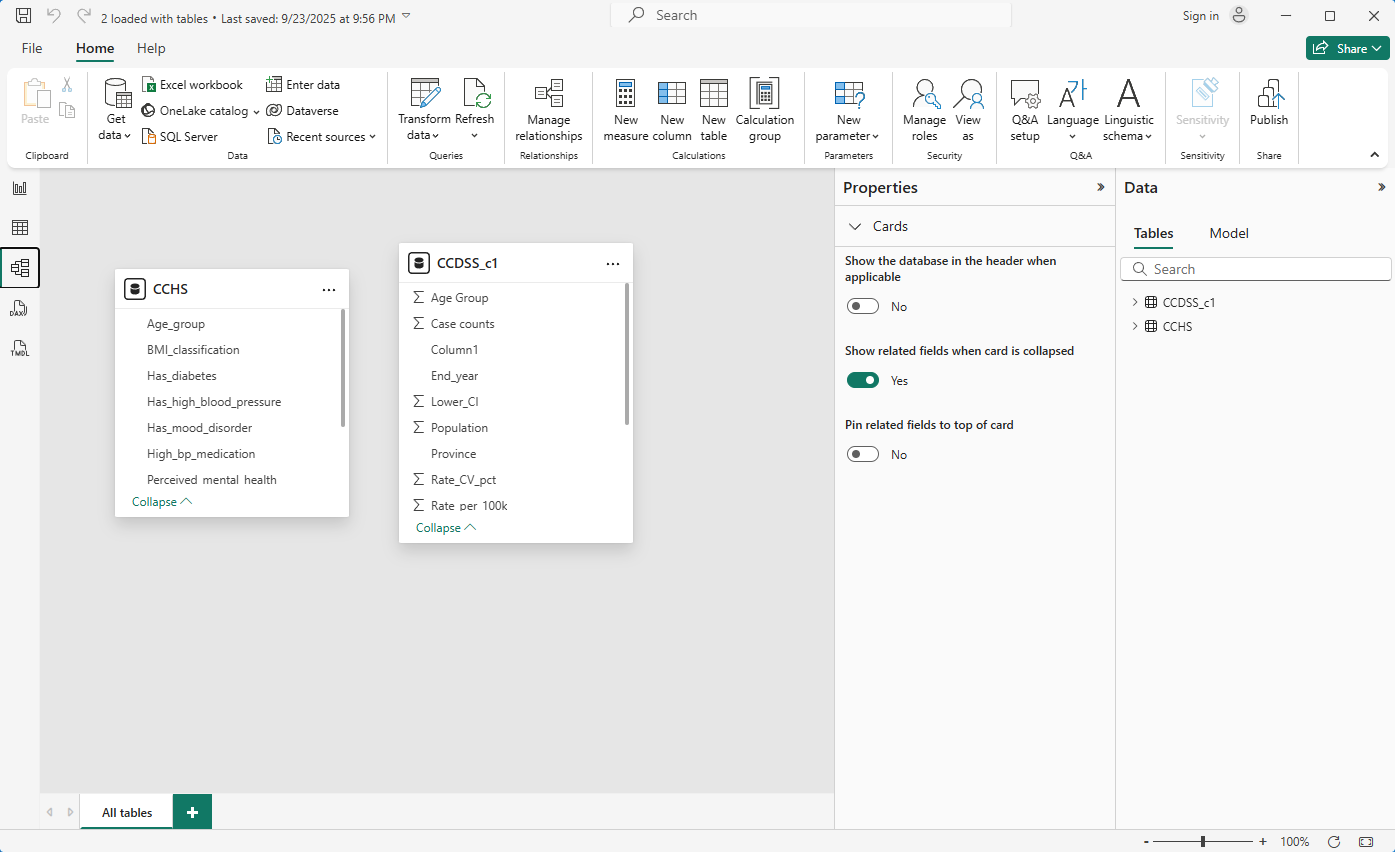
- Model Building: Established relationships between datasets in the ‘Model’ view by linking demographic and chronic disease data via a common field.
Phase 3: Analysis and Visualization
- Measure Creation: Wrote DAX measures in Power BI, e.g.,
Prevalence Rate = DIVIDE(SUM(ChronicDiseaseCases), SUM(Population)). - Visual Construction: Built a dashboard in the ‘Report’ view using:
- A Map to show disease prevalence by province.
- Bar Charts to compare conditions across age groups.
- Line Charts to display trends over time.
- Slicers for interactive filtering.
- Dashboard Design: Arranged visuals with titles, cards, and text boxes to create a clear, compelling narrative.
Phase 4: Publishing and Sharing
- Account Creation: Signed up for a free Microsoft account to use the Power BI service.
- Publishing: Published the report from Power BI Desktop to ‘My Workspace’ in the online service.
- Public Link Generation: Navigated to app.powerbi.com, selected File -> Publish to web (public) to generate a public URL and HTML embed code for portfolio integration.
Note
Note: Due to public sharing limitations in Power BI’s free tier, a programmatic approach was adopted using Python (pandas for data manipulation, PygWalker for interactive EDA) and JavaScript for web deployment.
Visualization 1: The Provincial Health Snapshot
Phase 1: Data Ingestion
- Initial Data Loading:
Phase 2: Data Wrangling and Preprocessing
- GeoJSON Feature Extraction: Extracted province names from the nested GeoJSON structure using a lambda function.
- Health Data Transposition: Transposed health data using
.Tand reset the index to create a ‘province’ column. - Data Type Standardization: Cast ‘province’ columns to string type for consistent merging.
Phase 3: Data Integration
- Key Cleaning with Regular Expressions: Removed extraneous characters from province names using
.str.replace()with regex[\\[\\]']. - Inner Join Operation: Merged DataFrames on the ‘province’ key using an inner join.
Phase 4: Exploratory Data Analysis (EDA) with PygWalker
- Environment Setup: Installed PygWalker using a try-except block for seamless setup.
- Interactive Visualization Interface: Used
pyg.walk()to generate a Tableau-like interface for drag-and-drop visualizations.
Phase 5: Data Structure Analysis and Deployment Strategy
- Analysis of Merged JSON Structure:
- GeoJSON Feature Collection: Stored in the
featurescolumn, encoding provincial shapes and locations. - Health Metrics: Quantitative and categorical data (e.g., ‘Perceived_mental_health’, ‘BMI_classification’) stored in separate columns.
- GeoJSON Feature Collection: Stored in the
- Limitations for Standard Charting Libraries: GeoJSON’s complex geometry requires geospatial libraries like Leaflet.js, not standard charting libraries like Chart.js or D3.js.
- Scope Limitations and Future Work: The dataset lacks CCDSS time-series data, limiting time-series or correlational analyses. Future work requires a new pipeline to incorporate CCDSS data.
- Proposed JavaScript Implementation:
- Save the DataFrame as a static
.jsonfile. - Use JavaScript’s
fetchAPI to load the JSON. - Create an HTML
<select>dropdown populated with health metric keys. - Initialize a Chart.js bar chart for a default metric (e.g., “High Blood Pressure”).
- Add an event listener to update the chart based on dropdown selections.
- Save the DataFrame as a static
Visualization 2: Time-Series Analysis of Chronic Disease in Seniors 📈
Phase 1: Data Subsetting and Feature Selection
- Subsetting the Demographic Cohort: Filtered
df_ccdssfor age 65+ using.copy(). - Feature Selection: Selected
Province,Year, andRate_per_100kcolumns.
Phase 2: Data Structuring for Client-Side Rendering
- Defining the Time-Axis: Extracted unique, sorted years as integers.
- Building the Datasets Array: Created dataset objects for each province, handling missing years with
None. - Dynamic Styling and Serialization: Assigned random border colors and serialized data to JSON.
Phase 3: Implementation Strategy for Web Visualization
- Data Persistence and Retrieval: Saved
chart_data_jsonas a static asset (e.g.,seniors_disease_rates.json) forfetchAPI retrieval. - Chart Configuration and Interactivity:
- Created interactive controls (checkboxes or multi-select dropdown) for provinces.
- Initialized a Chart.js
linechart with JSON data. - Added event listeners to filter datasets and call
chart.update()for dynamic rendering.
Loading chart...
Visualization 3: Health Factors vs. Outcomes Correlator 🧬
Phase 1: Data Sourcing and Ingestion
- Data Source Specification:
Phase 2: Temporal Synchronization and Data Filtering
- Temporal Synchronization: Identified 2019 as the common year for both datasets.
- Data Filtering by Common Year: Filtered both DataFrames for 2019.
Phase 3: Metric Calculation and Data Aggregation
- CCHS Health Factor Quantification: Calculated prevalence of ‘Has_high_blood_pressure’ as a percentage per province.
- CCDSS Senior Rate Extraction: Isolated
Rate_per_100kfor 2019 per province.
Phase 4: Final Data Integration and Structuring
- Merging Datasets for Correlation: Performed an inner merge on ‘province’ for 2019 data.
- Structuring Data for Chart.js: Converted rows to a JSON array of
{x, y, province}objects.
Phase 5: Implementation Strategy for Interactive Web Visualization
- Data Payload: Designed a nested JSON structure for dynamic selection of X-metric, Y-metric, and Year, with each plot as an array of
{x, y, province}objects. - Front-End Architecture: Used a
<canvas>for Chart.js and three<select>dropdowns for X-axis metric, Y-axis metric, and Year. - Client-Side Logic and Interactivity:
- Loaded data with
fetchAPI. - Added event listeners to dropdowns to update the Chart.js instance.
- Configured tooltips to display the ‘province’ property on hover.
- Loaded data with
Loading chart...
Project Summary: A Multi-faceted Analysis of Canadian Health Data
This project processed public health data from the CCHS and CCDSS to create three interactive visualizations using Python (pandas, PygWalker) and JavaScript (Chart.js).
- Visualization 1: The Provincial Health Snapshot 📊: Merged geospatial and CCHS data to create a JSON object for interactive bar charts comparing provincial health factors. Requires separate GeoJSON for cartographic libraries like Leaflet.js.
- Visualization 2: The Chronic Disease Rate Explorer 📈: Filtered CCDSS data for seniors (65+), transforming it into a JSON structure for a Chart.js multi-line chart showing provincial disease trends over time.
- Visualization 3: Health Factors vs. Outcomes Correlator 🧬: Merged 2019 CCHS and CCDSS data to create a JSON array for a Chart.js scatter plot, exploring correlations between health factors and senior disease rates.